Musiverse
Musiverse is a small app that assists budding musicians in finding gigs, and also helps them to initiate networking at the starting stage.
Visual Design
UX/UI Research
App Design
Rapid Prototyping
2 Weeks
6 Members
Figma, Miroboard
it's built
for
musicians
Infinite Connections
Instant Gigs
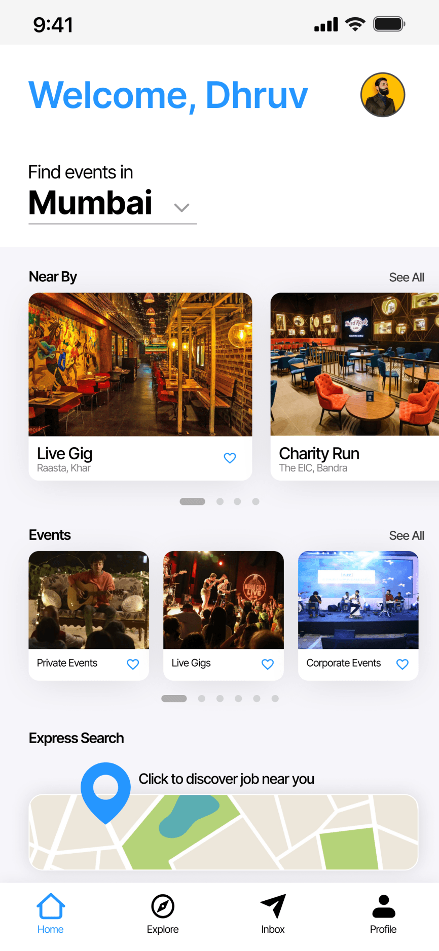
A digital platform empowering upcoming musicians through meaningful connections and access to opportunities. It assists professionals to swiftly establish foundational relationships essential for their genre related industry.
Musicians can apply for jobs closer to their location — this feature addresses the desire to make quick money and get some practice.

Express Search

Networking
Musicians will be able to connect with multiple other artists from this portal. From video feeds to viewing their work, artists can connect with other people more easily.
Curated Portfolio
Musicians can finally compile their work and showcase it on one common platform. They can also customize the data on the right so recruiters can quickly judge it.

Story Time
Imagine you’re a musician in a new city, struggling to find gigs without the right contacts. Pubs already have performers, and Instagram networking is slow. Frustration builds as you miss out on opportunities to showcase your talent. This was the situation right after Covid 19 in Mumbai.
The pandemic has had a significant economic impact on indie musicians in India, making it difficult for them to find work and afford living in major cities.
Understanding the Context
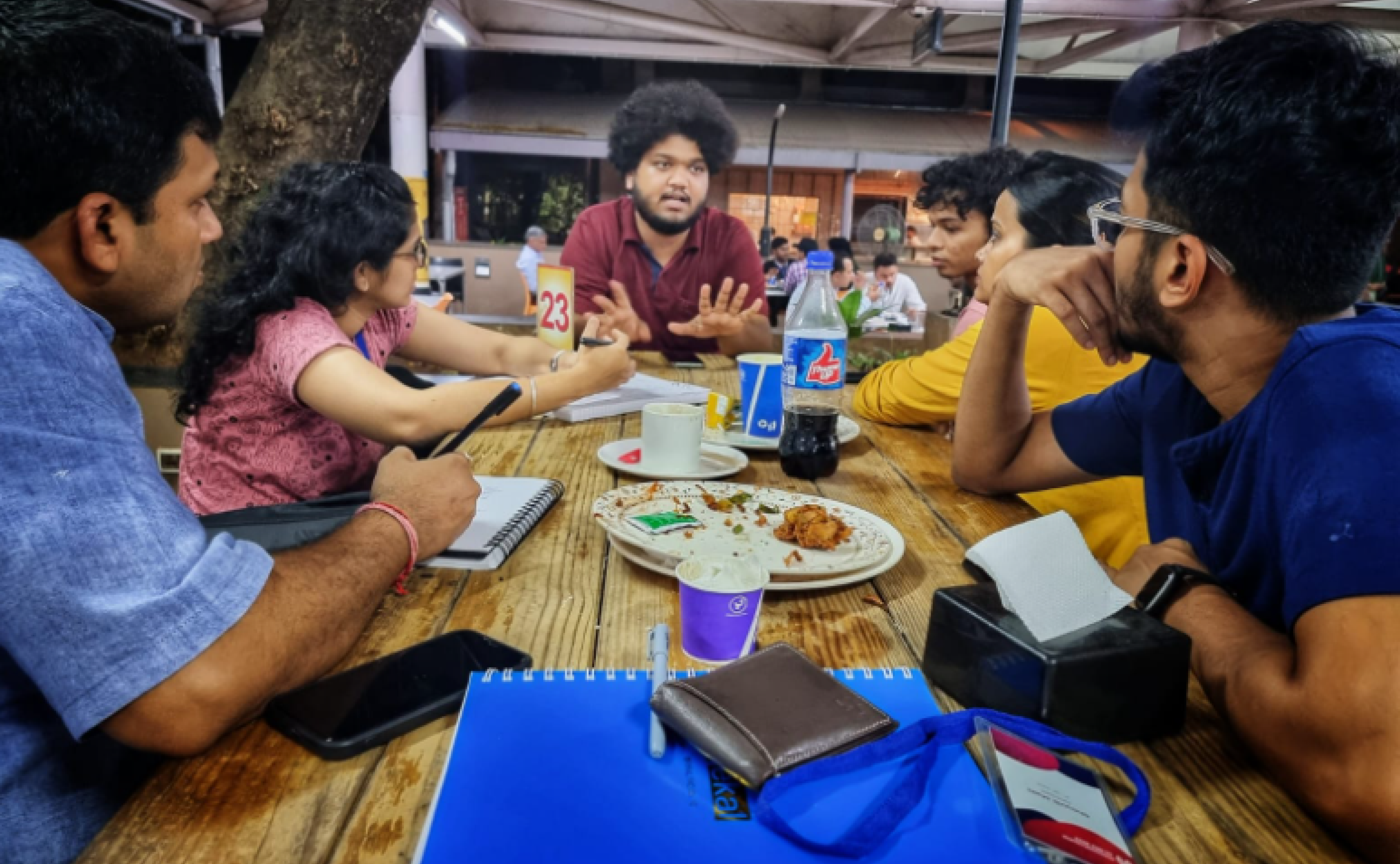
With an unfruitful desktop research, we interviewed 16 musicians, both budding and professional, as well as restaurant owners and hiring managers who organize live events, to better understand their challenges. Some of the insights were -
1
Need for an efficient networking system
2
An untapped market for new musicians
3
No defined portfolio for artists
Analyzing the Competition
There were a bunch of application musicians preferred to use. But the top three were Youtube, Instagram and BookmyShow. We conducted a competitive analysis and found out these few insights -
1
Networking through digital platforms is quite minimal
2
There is a lack of engagements in all layers
Problem Statement
How can we develop a streamlined network that matches musicians to jobs and collaborators within the music industry?
There is a highly fragmented and competitive landscape when it comes to musicians finding suitable opportunities, connections, and exposure.
Envisioning through Narratives
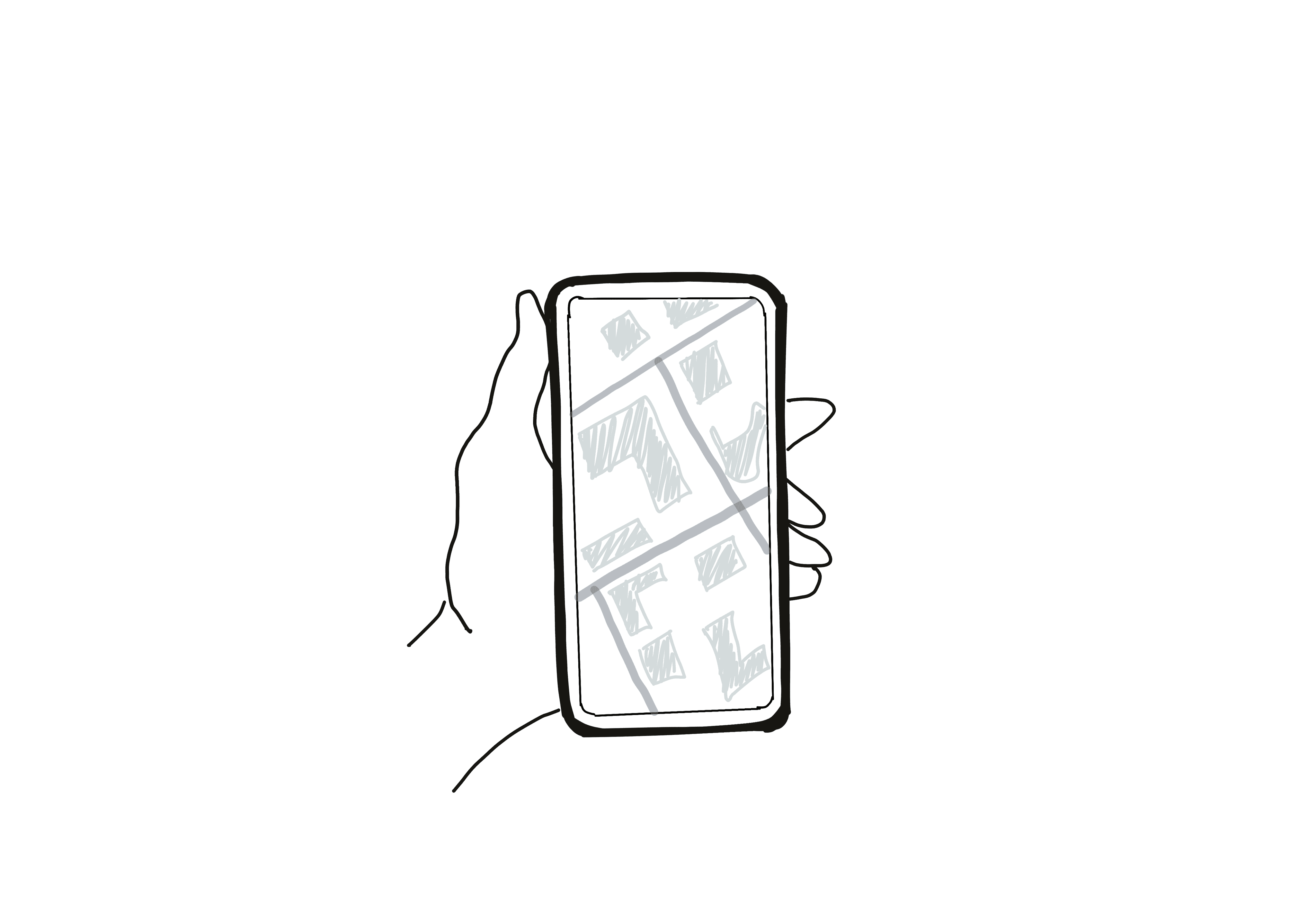

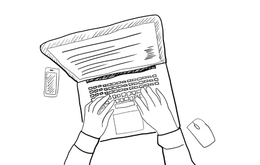
An app that shows the closest gig opportunities
Recruiters can view an in-built music portfolio
Able to land gig without the hassle of high intensity networking
Work opportunities by location
Local Gig Opportunities
Innovative display for music portfolios
Showcase your Music
Product Goals
By evaluating the information gathered so far, we can spotlight primary offerings the digital platform must emphasize, to align with user goals. Users should be able to do the following things -
1
Connect with the recruiters without any hassle
2
Navigate through the app and view details of live events.
3
Select events based on locality.
Testing Hi-Fi Prototypes
KEY FEATURE 1 :
CONSOLIDATED EVENTS SECTION
Search Functionality
The search option does not help the user as there is already too much content. Providing options for the users to select, maybe locations itself.
Accessibility
Gradient features and lack of contrast makes it challenging to differentiate different sections and buttons.
Color Scheme
The color pallet is extremely overwhelming, and jarring for users to focus on the content and the function.
KEY FEATURE 2 :
LOCATION BASED JOBS
Visual Overload
The map feature is difficult to understand, where the featured events are taking place. The visibility of each location is way too small for users to visually understand the content
KEY FEATURE 3 :
EXPLORING OTHER ARTISTS
Video Hierarchy
This has a very Instagram vibe to it, rather it would be helpful if I could see more content in one screen.
Option Overload
Discover, Musiverse and Network tabs create confusion of what the content might be, rather there should be a clear cut information.
KEY FEATURE 4 :
PORTFOLIO & PROFILE SECTION
USP
The USP Data is way too small for viewers to see it. The color combination does not help users to understand the content.
Wrapping Up
Learnings
Network-Driven Innovation
The project underscored the importance of network-driven innovation. Harnessing geolocation and profiling, we were able to create meaningful connections between users based on their skills and interests. Although understanding and prediction user behavior posed significant challenges.
Cross-Disciplinary Collaboration
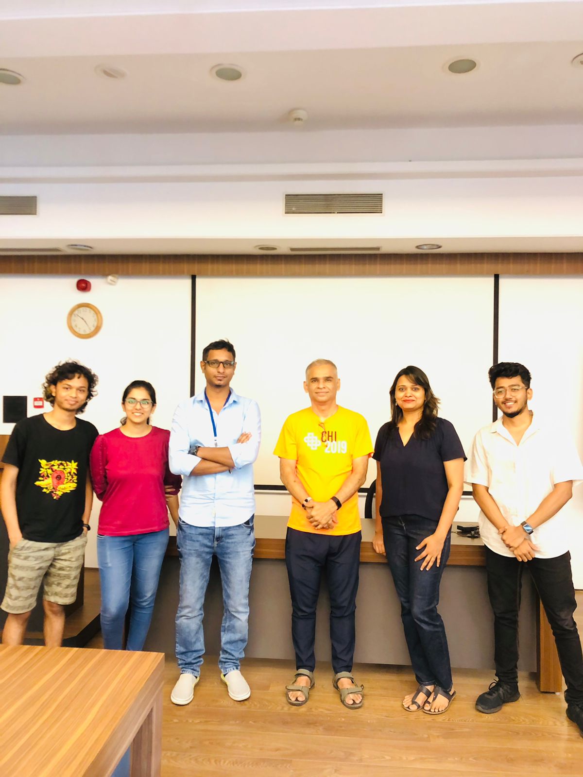
Working on this project let me team up with some really cool developers and design professionals. I got to hang out at IIT Bombay for 14 days where I learned a lot and drank lots of chai.
Thanks for viewing
View other projects
Optimized navigation and analytics for Jetsweat Fitness
B2B SAAS | DESIGN SYSTEM | SUMMER 24'
Shipped

